Note: this article was written based on data from 23 March. It was subsequently updated to reflect new figures from 24 March. Updates are in italics.
You can expect to see a lot more of the below two graphs in the coming days, weeks, and possibly months until the outbreak subsides and life returns to normal.
You may note, perhaps with some disappointment, that we have not included the rate of recovery nor the number of tests carried out - this is because we don't have full data on this for the entire time-span, as this has not been made available to date.
What we do know is that Minister of Health Paulette Lenert confirmed in a press conference on Sunday that Luxembourg is carrying out around 1,500 tests per day, which she described as one of the highest rates of testing per capita in the EU.
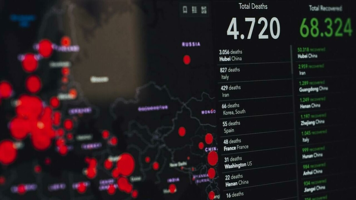
Before we look at the data, we would like to provide a little clarification on the data available more broadly through social media. You may have seen, for instance, that Luxembourg has one of the highest rates of new infections per capita. There are plenty of graphs floating around which show this, usually placing us second behind Iceland.
But why do these two countries stand out? The graphs that are making the rounds on social media could be seen as suggesting that the outbreak is far worse in Iceland and Luxembourg than elsewhere, but this is a conclusion that cannot be drawn. What we know is that Iceland is in fact testing at an exceptionally high rate - their government issued a statement saying that "Iceland has tested a higher proportion of inhabitants than any other country per capita."
While we unfortunately can't calculate the rate of testing in Luxembourg due to this data not being available, we do know that Prime Minister Xavier Bettel confirmed around 750 tests were carried out per day in a press conference on Friday 20 March, which at the time he described as a 'leading' rate in the EU, and as we noted above this has since risen to around 1,500 according to Paulette Lenert.
As such, it would be natural for the number of confirmed cases to continue increasing for the time being - a sentiment with which epidemiologist Joël Massong agrees. What needs to be understood here is that one cannot easily compare any two countries based solely on the confirmed rate of infection, or growth thereof. To compare a bit more accurately, we would also need to know how many tests are carried out in total, and the criteria for testing - if one country tests anyone who asks to be tested while another only tests those with severe symptoms, for instance, this would also explain some of the discrepancy we are seeing.
As such, we will not be making international comparisons in this article, and focus solely on Luxembourg's data.
You will have seen charts like this one both here on RTL Today and in other national media. The graph below shows the evolution in the total number of confirmed cases in Luxembourg.
This is the most basic chart one can present, and arguably the one that looks the most alarming due to the steep increase of the curve. That said, it is not the most interesting chart one could produce - and is more a reflection of the lack of data available. As we noted above, it would be far more interesting to see the rate of positive test results per number of tests carried out, for instance, but unfortunately we do not have sufficient data to do this.
What we can do is look at how many new cases are confirmed each day, so let's look at that next.
The below graph shows how many new confirmed cases have been communicated by the ministry of health in a given day since the start of the outbreak.
This looks a bit more reassuring than the above graph, but is based on the exact same data. As you can see, we saw a pretty substantial drop in confirmed cases after the spike on 21 March, as a decreasing number of new cases were confirmed in the subsequent two days (the most recent for which data is available at the time of writing, morning of 24 March).
So, does this mean that we can expect the trend to continue? Unfortunately, while there is the suggestion of an inflection point, it's too early to tell, and quite unlikely. As noted by Paulette Lenert, the government is "expecting a rising number of infections". The chart also shows that we have seen large day-to-day drops previously, such as between 12 March and 13/14 March, and again between 15 and 16 March, followed by substantial increases. An important reminder is that one cannot glean much from looking at short-term developments in such a limited dataset.
Update: As we suspected, the downward trend did not last. Do keep in mind that the reasons for this can be many, and this does not mean that the current strategy does not work. We know for instance that more tests are being done, and we are still well within the two weeks since the panic shopping behaviour we saw following an increase in cases, with people packed close to each other in supermarkets. These are just a small selection of factors. Beyond that, this is a long-term game plan, and the important thing for it to work is that we all stick to it.
The strategy adopted by many European governments aims to 'flatten the curve' - a phrase you are likely to have seen pretty much every day since the early days of the outbreak. If it works, what we would expect to see is a gradual decrease of new daily confirmed cases over time, but for a longer time than if the virus had been allowed to run its course without measures such as social distancing.
So what conclusion can we draw from all of this? In sum:
1 - International comparisons are very difficult at the moment due to differing data availability and testing procedures;
2 - The most common graph (total number of confirmed infections) is interesting, but has its limitations;
3 - We can't draw many real conclusions based on the current publicly available data; and most importantly
4 - Respect the measures taken by the government, as it will only work if we are all in this together and do our part.


