
The media constantly presents us with large amounts of numbers and statistics.
Especially in times of fake news and alternative facts, it's important to closely examine and correctly interpret data.
Statistics play a crucial role in this context.
They help us identify trends and patterns in data and use that knowledge to draw conclusions or make decisions.
However, in everyday life, mistakes are made again and again – whether intentionally or not – when using statistics.
We'll show you five common mistakes people make when interpreting statistics and how to avoid them.
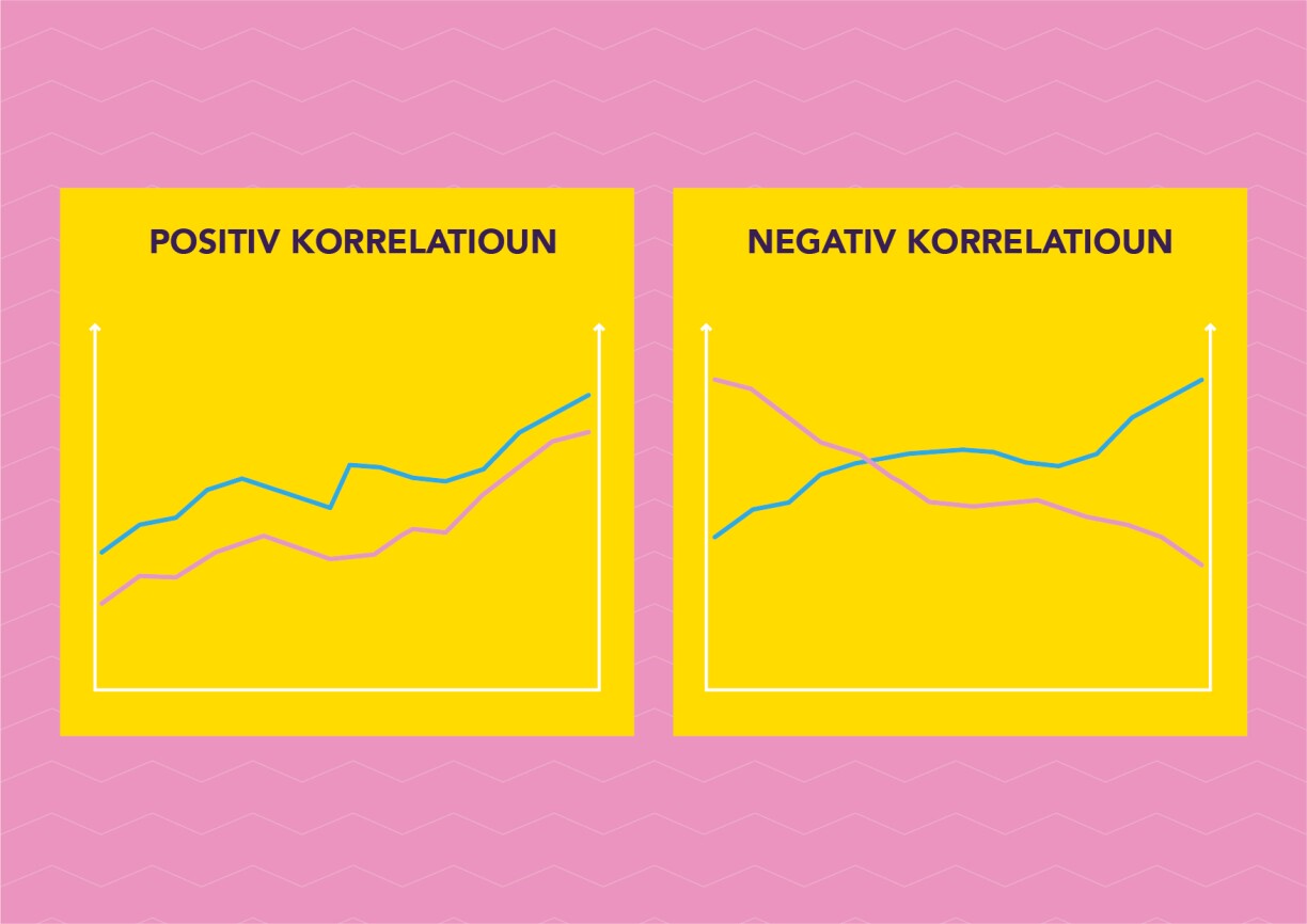
A positive correlation occurs when two values point in the same direction. A negative correlation occurs when one value increases while the other decreases.
Causality occurs when one value influences the behaviour of another. In other words, when there is a cause and effect relationship between the two. E.g. the more alcohol you drink on a night out, the drunker you get.
The situation is different in this example: the black line represents butter consumption in the United States, while the red line represents the divorce rate in the US state of Maine.
The two values exhibit a strong correlation, but there is no causation. It would be a mistake to conclude that because people are eating less butter in the US, there are fewer divorces in Maine.
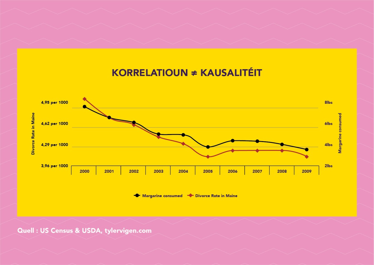
Unfortunately, this is a common mistake. A headline may claim, for example: “Study suggests people live longer if they drink a lot of red wine." But that does not automatically mean that living to an old age is attributable to the red wine. Maybe these people were more socially and physically active and therefore lived longer?
So our advice is: always question whether a correlation actually reflects causation.
If a company reports it has achieved a 100% sales increase compared to the previous month, this sounds great.
But if it sold one item with little turnover in the previous month and two in the following month, the statement about 100% growth is still accurate, but no longer as impressive. It's different when a company sells millions of items per year with a substantial turnover. In that case, a slight increase in sales percentage is much more significant than a situation with small absolute numbers.
Let's now look at the fictitious salaries of managers and workers in a company. The management claims that workers received a higher raise: 10%. The executives only had a 5% raise. This graph also depicts this accurately.
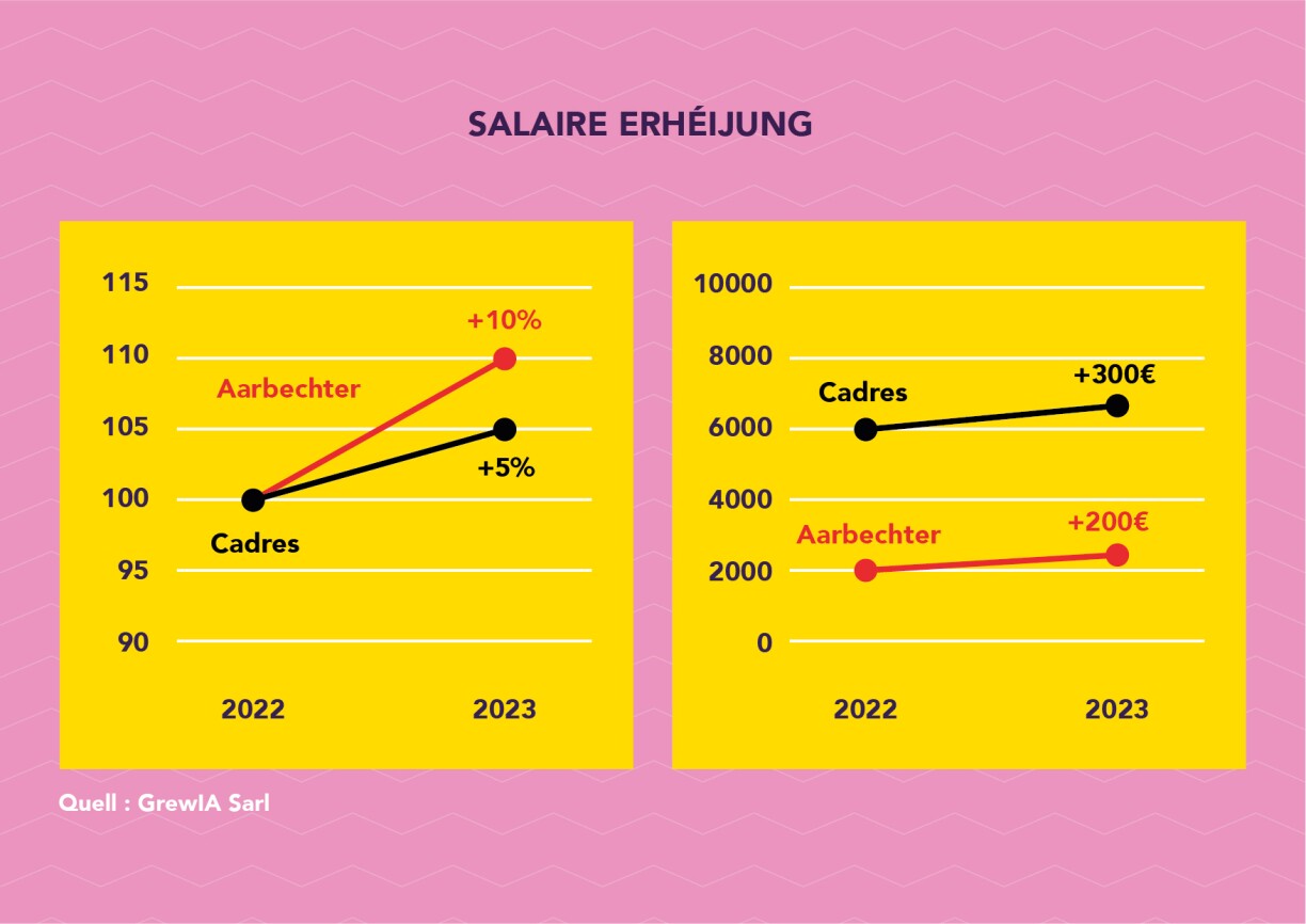
But don't think that this automatically means that the workers actually received more money than the executives.
Let's assume, for example, that workers initially earned €2,000 while the executives' salary was €6,000. In this scenario, although the workers did gain more in percentage terms, the executives still ended up with a larger absolute amount. The executives received €100 more than the workers.
Our advice: when it comes to percentage growth, always look at the absolute figures as well.
Let's take a fictitious example of a party's election results compared to the previous elections. The party says it gained a large number of votes. At first glance, the graph seems to support this claim. Upon closer examination, it turns out that the party has zoomed in. When you see the graph in its entirety, you realise that the difference is quite small.
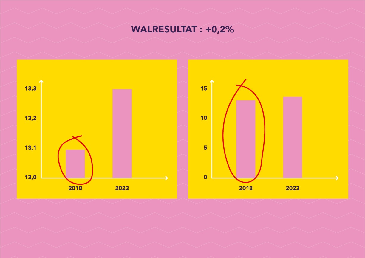
Graphs can also be compressed or stretched to make the disparities appear more or less significant.
Our advice: always check the labelling of the axes and the scale used.
Once again, let's take a fictitious company as an example. In this company, on average, men earn more than women. But if we analyse individual categories within this company, such as the executives, middle management and assistants, we find out that women earn more than men in each category.
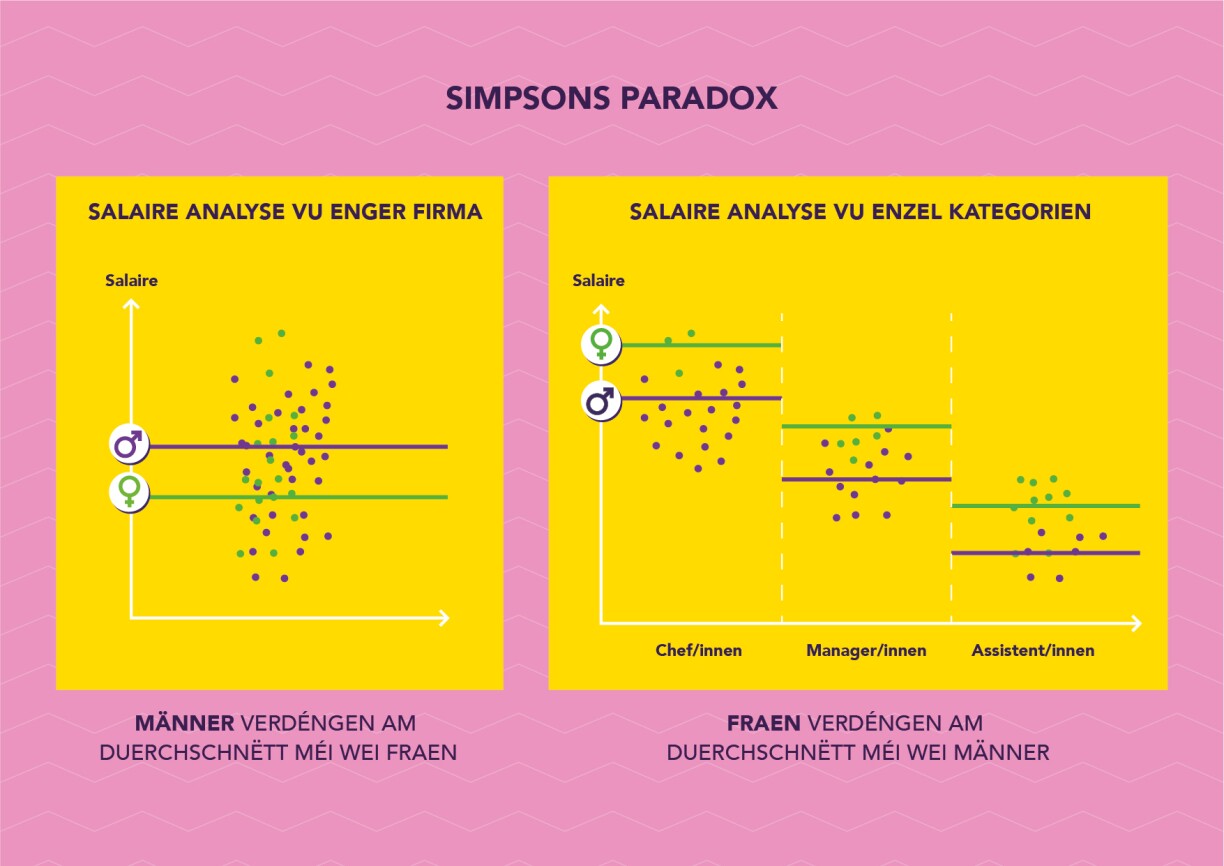
How is this possible? In the case of this company, despite women earning more within each category, a larger proportion of women work in lower-paid assistant positions, while fewer women occupy executive positions. Without the second piece of information, we might mistakenly assume that men in this company earn more for the same work.
However, after a more detailed analysis, we can see that the opposite is true and that the problem is that the men hold higher positions in the company.
Our advice: when confronted with statements about averages, always question whether the situation is different in subcategories.
To illustrate this, let's imagine a small village with 100 residents. On average, each resident possesses €100,000 in assets.
Then a billionaire moves into the village, with assets of €3 billion. Now we have 101 inhabitants, and the average wealth jumps to €29.8 million. The other residents haven't become wealthier overnight, of course. But the average is not very meaningful when one or more extreme values are present, especially with small populations.
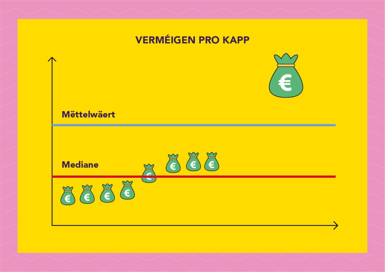
In this case, it would be better to choose the median. The median is a value situated precisely in the middle of a data set. In this example, the median represents a level of wealth which half of the village population is below and the other half is above. The median remains relatively unchanged if one more resident moves in, regardless of how much they earn.
And this reflects the reality of the other 100 villagers much more closely.
Statistics are extremely useful. They allow us to better analyse and contextualise data so that important decisions do not have to be made on gut instinct.
Avoiding mistakes often requires understanding the context and discerning what statistics indicate and what they don't.
So stay alert and think critically.
Ziel mir keng! is broadcast on Sunday evenings after the programme Wëssensmagazin Pisa on RTL Tëlee and is a collaboration between RTL and the Luxembourg National Research Fund. You can also watch the episodes on RTL Play.
Author: Jean-Paul Bertemes (FNR)
Peer reviewer: Professor Christophe Ley (University of Luxembourg, GrewIA)
Editing: Lucie Zeches (FNR)
Graphs: George Dos Santos R., Antone Stepine (Headroom)
Production and video editing: Dominique Weber (SKIN)
Camera: Océane Maître (SKIN)
Lighting: Dave Schmit (SKIN)
Translation: Nadia Taouil (www.t9n.lu


