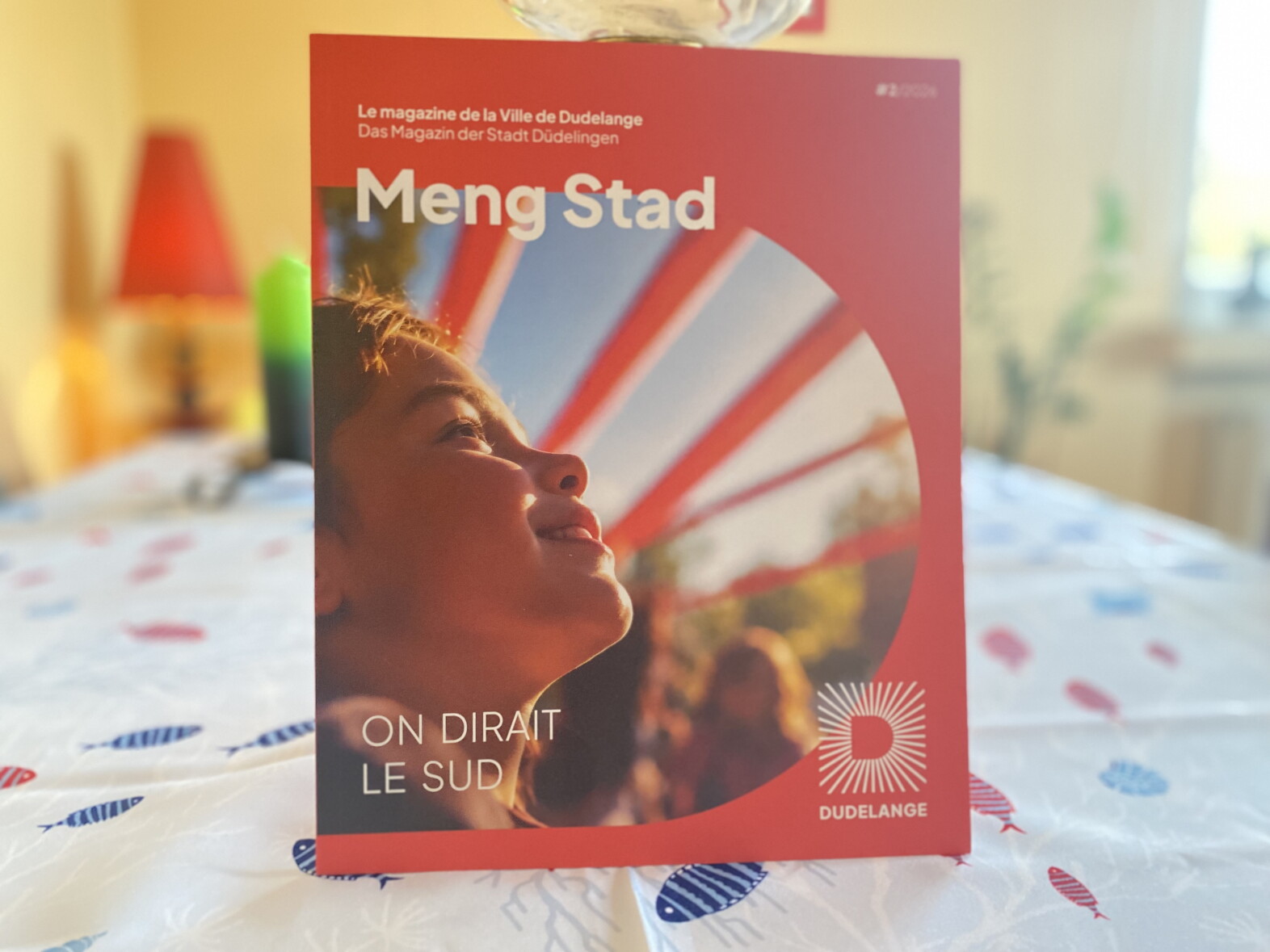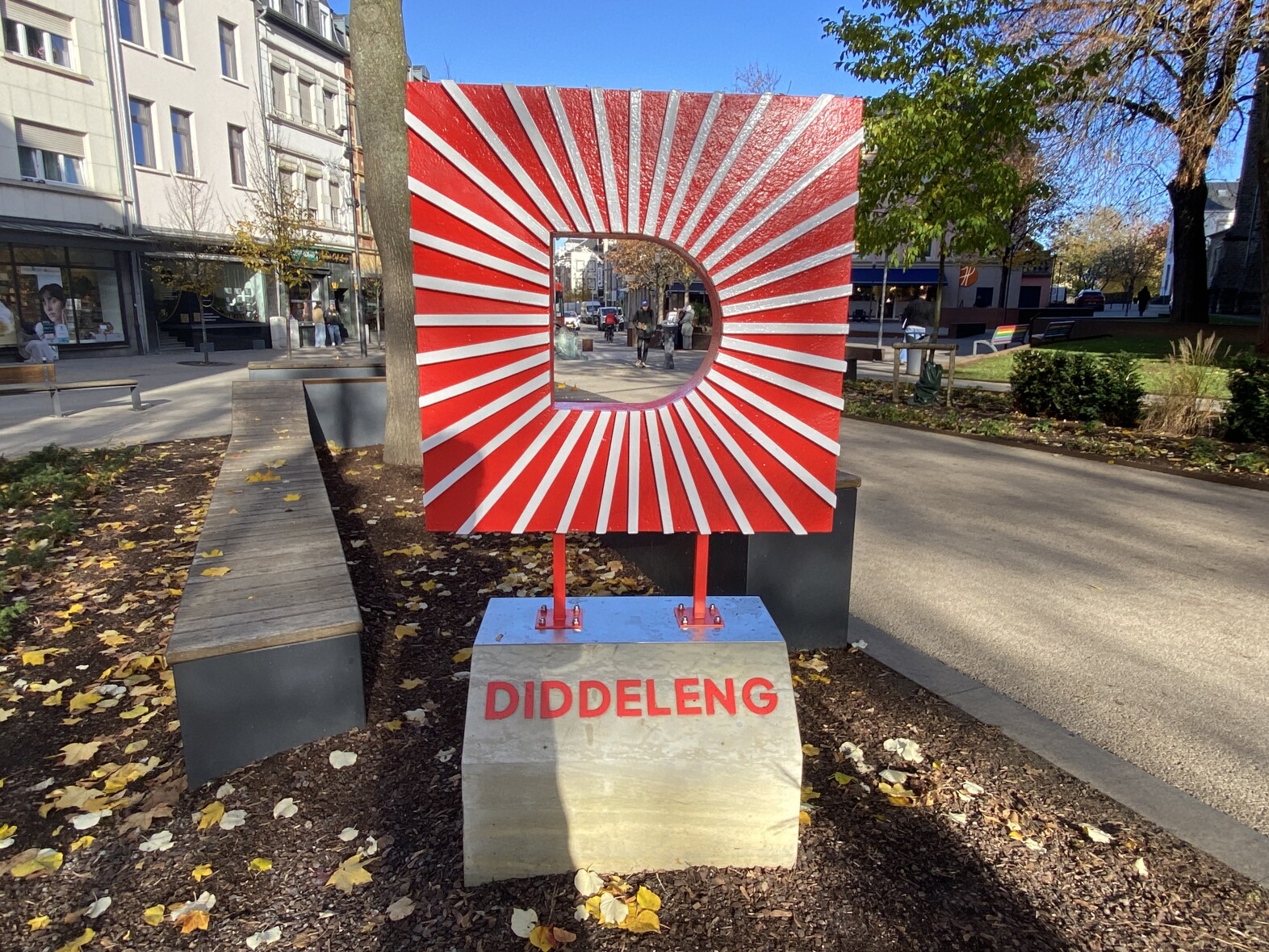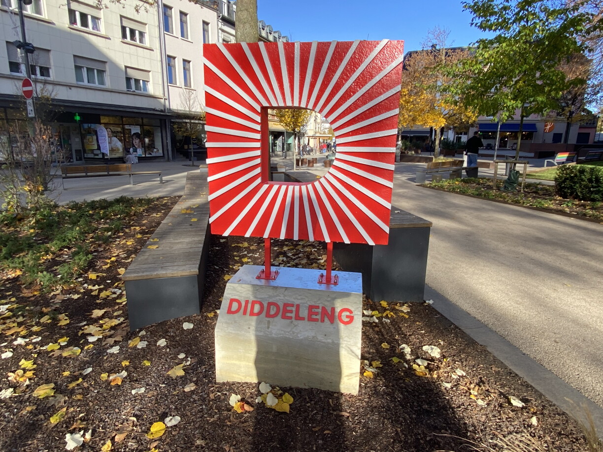
After twenty years, Dudelange officials decided it was time to update the city's logo and overall visual identity. Mayor Dan Biancalana explained that the previous design, which depicted the city hall, no longer represented the full scope of what Dudelange stands for. "Dudelange is much more than just the city hall," he said. "It is a city with a strong history, a rich cultural life, dynamism, and great diversity. Dudelange is known for its many initiatives and high quality of life. It is a city that continues to develop. That is why we wanted to create a visual identity that better reflects these many facets."
Biancalana stressed that the goal was not to break with the past, but to reinterpret Dudelange's history and identity in a more contemporary style.
The process of redesigning the city’s branding began in late 2024 and early 2025, in what Biancalana described as a participatory process involving municipal staff. On Tuesday, under the motto "Liewe wéi am Süden"("Living the Southern Way"), Dudelange unveiled its new visual identity, including the new logo. However, the announcement triggered a wave of reactions on social media, most of them negative. Among the criticisms, many people commented that the new logo resembles the Japanese "Kyokujitsuki" military flag.
Biancalana acknowledged the mixed feedback: "I understand that a new logo can prompt a range of opinions. We did not develop this new identity to impose something on anyone. The aim is to represent Dudelange's diversity. A logo alone can never capture all the richness and identity of a city; it can only act as a visual signature."
The new logo cost €37,000, and its rollout will be gradual. "We still have supplies with the old logo, such as stationery and envelopes, and we will continue to use these until they run out. Some elements of the implementation will also be handled internally by our own departments," Biancalana added.
The city council was presented with the new visual identity during a session on 26 October. Council members received a detailed explanation of the process. "We provided all the necessary explanations in detail. The meeting included a thorough and constructive discussion, and the new logo was broadly welcomed across party lines. Its versatile uses were recognised," Biancalana said during the interview.